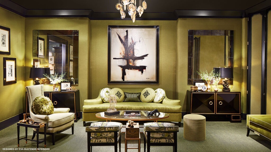
For the Merchandise Mart’s Dream Home 2015 project designer Eva Quateman created a luxury living room space brimming with rich color and style that hearkens back to the mid-20th Century. We sat down with her to get a feel for what inspired her design choices.
What inspired the design of your room?
The green Chinese fabric was the main inspiration for the overall aesthetic and design of the Dream Home living room. It was Chinoiserie in style, and I had seen it in a showroom and carried around a sample of it with me for over a year, to try and find a use for it. It is such a beautiful, unique green chartreuse color, and I knew I had to use it.
How do you (did you) select a frame to complement the art, but also design within a room?
I think frames are just as important as art. I love selecting frames as much as I love finding great pieces of art and find both to contribute to a space’s decor. I’d equate it to buying and wearing a Chanel suit and then proceeding to carry a bag handbag. Nice art is worth encasing in something equally as nice. Tones and profiles can be mixed and matched in many different ways, but if it’s not quality or deliberately chosen…it sticks out.
How do you determine the placement of framed art in a room?
The placement of art all depends on how impactful it is. If it’s large, it may very well be a statement piece. If it’s smaller it may emphasize the other statement pieces in a room, such as a mantle or a pair of bookcases. For me, I like to keep fabrics and other pieces more neutral and have the frames and the art speak for themselves.

